Our reviews are based on aggregated verified buyer feedback, manufacturer specifications, and published expert opinion. Products are not independently tested by our team.
Staring at a blank 12×12 page wondering where to put your photos is one of the most common sticking points for scrapbookers. Layout design doesn’t need to be intimidating. These 15 proven page designs work for virtually any occasion and skill level. Each one provides a clear structure that guides your photo placement, journaling, and embellishment decisions so you can focus on the creative fun rather than the structural planning.
Use these layouts as starting templates. Follow them exactly for your first few pages, then adapt and modify them as your confidence grows.
Layout Design Basics
Before diving into specific layouts, understanding a few design principles makes every page better.
Visual hierarchy: Every page should have a clear focal point, usually your most important photo. Make it the largest element. Other elements support and frame the focal point without competing for attention.
The rule of thirds: Mentally divide your 12×12 page into a 3×3 grid. Placing your focal photo and title at the intersections of these grid lines creates natural visual balance. Centering everything works too, but off-center placement adds energy and interest.
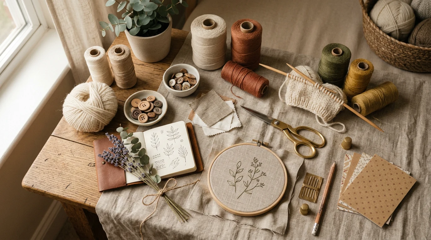
Color coordination: Pull 2-3 colors from your photos and echo them in your paper, embellishments, and mats. This creates cohesion even when different elements come from different sources.
Odd numbers: Groups of 1, 3, or 5 photos and embellishments tend to look more pleasing than groups of 2 or 4. This is a general guideline, not a strict rule, but it helps when you’re unsure about quantities.
Single Photo Spotlight Layout
The simplest and most impactful layout. One enlarged photo (5×7 or 8×10) takes center stage, matted on contrasting cardstock and positioned slightly off-center. Title above or beside the photo. Journaling below. A small cluster of 2-3 embellishments in one corner provides visual balance.
This layout works beautifully for milestone moments, portraits, and any photo that’s strong enough to carry a page by itself. The simplicity draws all attention to the image, letting the photo tell the story while the journaling provides context.
Best for: Milestone events, portraits, landscape photos
Photos needed: 1
Skill level: Beginner
Grid Layout for Multiple Photos
Arrange 4, 6, or 9 equal-sized photos in a neat grid pattern on the page. Leave consistent spacing (1/4 inch) between photos. Title centered above the grid. Journaling centered below or on a small strip alongside the grid.
Grid layouts are excellent for events with many great photos, like birthday parties, holiday gatherings, or a day at the park. The uniform arrangement looks organized without being boring, especially when the photos themselves provide variety through different angles and subjects.
Best for: Events with multiple good photos, daily life documentation
Photos needed: 4-9
Skill level: Beginner
Timeline Layout
Place photos in chronological order across the page, connected by a visual line (drawn, stamped, or created with ribbon or washi tape). Photos can be different sizes and staggered above and below the timeline. Add dates or captions beneath each photo. This layout naturally tells a story through sequence.
Timeline layouts work well for events that unfold over time: a child’s first year, a vacation day-by-day, or a home renovation project. The chronological flow makes the page intuitive to read and understand.
Best for: Stories that unfold over time, before-and-after sequences
Photos needed: 3-6
Skill level: Beginner-Intermediate
Travel Page Design
Layer a map element (printed or hand-drawn) as the background. Arrange photos as if they’re placed at locations on the map. Include travel ephemera: ticket stubs, boarding passes, restaurant cards, or postage stamps. Use washi tape, string, and small tags to create a travel-journal aesthetic.
This layout style captures the adventure and exploration feel of travel. The layered, slightly imperfect arrangement mirrors the spontaneity of a trip, making it one of the most enjoyable layouts to create and view.
Best for: Vacations, road trips, day trips, exploring new cities
Photos needed: 3-5
Skill level: Intermediate
Birthday and Celebration Layout
Feature one main celebration photo (blowing out candles, opening gifts) at the center, surrounded by smaller photos of guests, decorations, and candid moments. Use festive embellishments: banners, confetti stickers, balloon shapes. Include the age or milestone prominently in the title. Reserve space for journaling that captures memorable moments and quotes.
Birthday pages are among the most popular in any scrapbook. The combination of a clear focal photo with supporting details creates a complete picture of the celebration.
Best for: Birthdays, anniversaries, graduations, retirements
Photos needed: 3-5
Skill level: Beginner
Seasonal and Holiday Pages
Build the page around a seasonal color palette and themed paper. Use autumn tones and leaf shapes for fall pages, pastels and florals for spring, red and green for Christmas, or beach tones for summer. Arrange 2-3 photos with seasonal embellishments and journaling about traditions, activities, or what made that season special.
Seasonal pages create a natural rhythm in your scrapbook and are wonderful for documenting annual traditions that your family repeats year after year.
Best for: Holidays, seasonal activities, annual traditions
Photos needed: 2-4
Skill level: Beginner
Minimalist Modern Layout
White or solid-colored cardstock background. One or two photos with thin, clean mats. A simple sans-serif title. Short, focused journaling. Minimal embellishment: perhaps a single strip of washi tape, a small sticker, or nothing at all. Maximum white space. The photos and words carry the page entirely.
This style is popular among contemporary scrapbookers who value clean design. It’s fast to create, requires minimal supplies, and puts the emphasis entirely on the memories rather than the decoration. Photos with strong composition work especially well in minimalist layouts.
Best for: Everyday moments, artistic photos, modern aesthetic
Photos needed: 1-2
Skill level: Beginner
Pocket Page Layout
Pocket pages use pre-made page protectors divided into pockets of various sizes (3×4, 4×6, etc.). You slip photos, journaling cards, and ephemera into the pockets without adhesive. No glue, no measuring, no anxiety about permanent placement.
This format is incredibly popular for daily or weekly documentation (Project Life style) because of its speed. You can fill a pocket page in 10 minutes. The structured pockets eliminate layout decisions while still producing attractive, organized pages. It’s the fastest way to get memories into an album.
Best for: Daily/weekly documentation, fast scrapbooking, event recaps
Photos needed: 4-8
Skill level: Beginner
Two-Page Spread Design
For events with many photos or stories that need more space, a two-page spread uses both the left and right pages as one unified design. This doubles your workspace and allows for more photos, more detailed journaling, and more elaborate design.
The key to a successful spread is visual unity. Use coordinating papers across both pages. Let design elements cross the center gap. Place the title on one page and let it relate to content on both pages. Use a consistent color scheme and embellishment style.
Two-page spreads work well for major events: weddings, vacations, holidays, and milestone celebrations that deserve expanded treatment. They also create natural chapter breaks in your album.
Best for: Major events, vacations, stories with many photos
Photos needed: 5-10
Skill level: Intermediate
Tips for Consistent Page Design
Consistency across your album creates a polished, professional look. Here are strategies for maintaining visual cohesion without making every page identical.
Choose a limited color palette for the album. Three to five base colors that appear across most pages create unity. You can vary the specific papers and embellishments, but keeping the color family consistent ties everything together.
Use consistent photo mat widths. Whether you choose 1/4 inch or 1/2 inch mats, keeping the width consistent across pages creates a subtle but effective visual thread. Similarly, consistent spacing between elements (1/4 inch is standard) adds polish.
Stick to 2-3 fonts. One font for titles and one for journaling is sufficient. Adding a third for accent text is optional. More than three fonts creates visual chaos. This applies whether you’re hand-lettering, using stickers, or cutting with a Cricut machine.
Place journaling in the same general area on each page. Bottom third is the most common position. Consistent journaling placement makes your album intuitive to read and establishes a visual rhythm. According to design principles outlined in the Interaction Design Foundation’s visual design guide, consistency in element placement is one of the most powerful tools for creating professional-looking page designs.
Frequently Asked Questions
How many photos should I put on one page?
For a 12×12 page, 1-4 photos is the comfortable range for most layouts. Single-photo pages make the strongest visual statement. Multi-photo pages tell a more complete story. Going above 6 photos on one page risks overcrowding unless you use smaller print sizes (3×4 or wallet-size).
What if I don’t have good photos for a layout?
Create journaling-focused pages with minimal or no photos. A beautifully designed page with a heartfelt written story, a meaningful quote, or a list of memories is every bit as valuable as a photo page. You can also use memorabilia (ticket stubs, programs, cards) as the visual element instead of photos.
Should I plan layouts before assembling them?
Planning is helpful, especially for beginners. Lay out your photos, papers, and embellishments on the page before adhering anything. Take a phone photo of the arrangement so you can recreate it if elements shift during assembly. As you gain experience, you’ll be able to design more intuitively. For supply recommendations, see our beginner supply guide.
Frequently Asked Questions
What should I do if I’m overwhelmed by a blank scrapbook page?
Start by using one of the 15 proven scrapbook layout ideas provided in this guide. These templates give you a clear structure for photo placement, journaling, and embellishments, so you can focus on the creative aspects rather than worrying about the overall design. Follow the layout exactly for your first few pages, then adapt them as your confidence grows.
How do I create visual balance on my scrapbook pages?
Use the rule of thirds by dividing your 12×12 page into a 3×3 grid and placing your focal photo and title at the grid intersections. This creates natural visual balance without making your page feel static. While centering elements also works, off-center placement adds more energy and interest to your design.
How many photos should I include in one scrapbook layout?
Grouping 1, 3, or 5 photos tends to look more visually pleasing than groups of 2 or 4. This odd number principle is a helpful guideline when you’re deciding on quantities, though it’s not a strict rule you must follow.
What’s the easiest scrapbook layout design for beginners?
The Single Photo Spotlight Layout is the simplest and most impactful option for beginners. This design features one enlarged photo (typically 5×7 or larger) as your focal point, making it easy to create a striking page without complicated structural decisions.