Learning how to paint watercolor flowers opens up a world of artistic expression that’s both relaxing and rewarding. Whether you’re drawn to the delicate petals of a rose or the cheerful simplicity of daisies, watercolor painting offers a gentle medium perfect for capturing nature’s beauty. This comprehensive tutorial will guide you through creating stunning floral artwork, even if you’re picking up a brush for the very first time.
Our reviews are based on aggregated verified buyer feedback, manufacturer specifications, and published expert opinion. Products are not independently tested by our team.
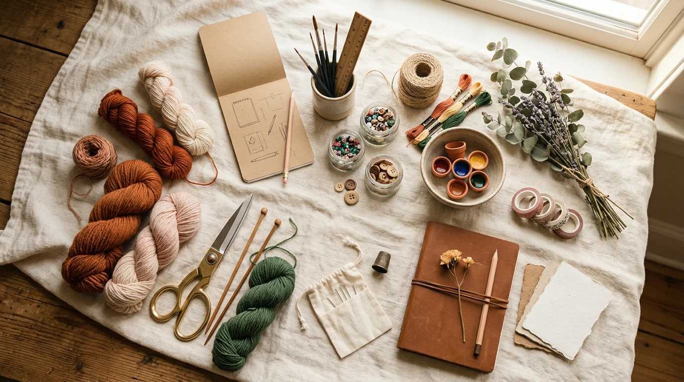
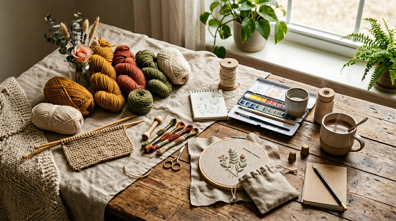
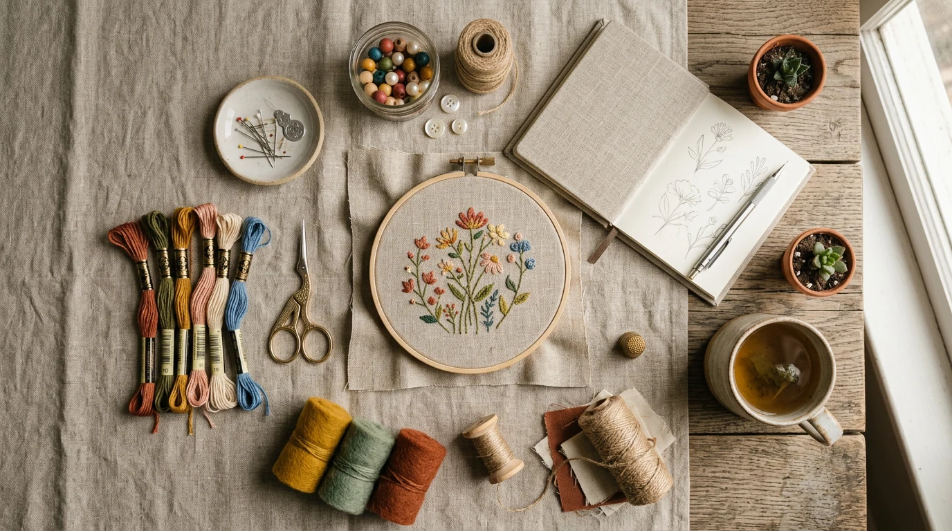
Supplies for Painting Watercolor Flowers
The beauty of watercolor flower painting lies in its simplicity – you don’t need an overwhelming array of supplies to create gorgeous artwork. Starting with quality basics will make your learning journey much more enjoyable and successful.
For watercolor paints, beginners often find great success with the Winsor & Newton Cotman set, which offers excellent color mixing capabilities at an affordable price point. Many experienced artists recommend Daniel Smith Extra Fine Watercolors for their vibrant pigments and smooth application, while the Kuretake Gansai Tambi paints provide beautiful, intense colors that work wonderfully for floral subjects.
Paper selection significantly impacts your results. Arches watercolor paper in 140lb cold press weight remains the gold standard – its texture holds paint beautifully while allowing for gentle corrections. The Canson XL Watercolor pad offers a more budget-friendly option that still delivers quality results, and the Strathmore 400 Series provides excellent practice paper for beginners.
Your brush collection should include a few versatile sizes. Princeton Heritage brushes offer excellent water retention and maintain their points well. Da Vinci Casaneo brushes provide synthetic bristles that mimic natural hair performance, while Silver Black Velvet brushes combine synthetic and natural fibers for optimal paint control.
- Watercolor paints (tube or pan format)
- Watercolor paper (140lb minimum weight)
- Round brushes in sizes 6, 10, and 14
- Detail brush (size 2 or 4)
- Natural sea sponge
- Spray bottle for misting
- Paper towels or clean cloth
- Masking tape
- Two water containers
- Palette or mixing surface
Color Palette for Floral Painting
Creating beautiful watercolor flowers doesn’t require every color in the rainbow. A carefully selected palette of six to eight colors will serve you well for most floral subjects. Understanding color mixing principles will expand your possibilities exponentially.
Start with primary colors: Cadmium Red Light, Ultramarine Blue, and Cadmium Yellow Light. These form the foundation of your mixing capabilities. Add Permanent Rose for delicate flower tones, Sap Green for natural foliage, and Raw Umber for earthy stems and shadows.
Buyers frequently praise the Schmincke Akademie line for its reliable color consistency and excellent mixing properties. The pigments blend smoothly and maintain their vibrancy even when diluted significantly – perfect for the transparent layers that make watercolor flowers so luminous.
Secondary colors emerge through mixing: purple from red and blue, orange from red and yellow, and green from blue and yellow. However, having a pre-mixed green like Sap Green saves time and ensures consistency in your foliage work.
| Color | Purpose | Mixing Options |
|---|---|---|
| Cadmium Red Light | Rose petals, warm flowers | Mix with blue for purple |
| Permanent Rose | Delicate pink tones | Perfect for cherry blossoms |
| Cadmium Yellow Light | Sunny flowers, centers | Mix with red for orange |
| Ultramarine Blue | Cool shadows, mixing | Combine for all purples |
| Sap Green | Leaves, stems | Add yellow for spring greens |
| Raw Umber | Natural shadows, bark | Warm mixing for earth tones |
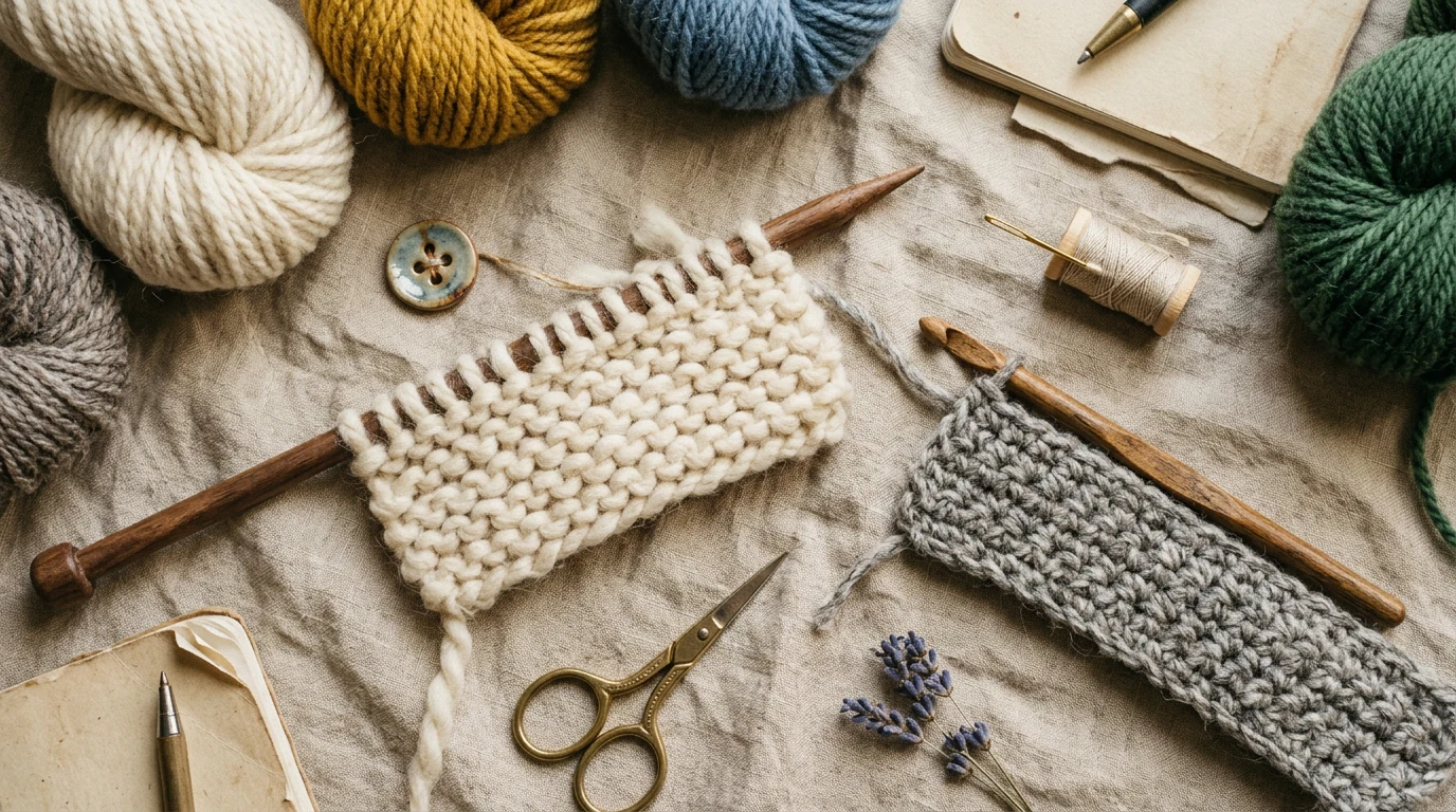
Painting Simple Leaves
Before diving into complex flower forms, mastering simple leaf shapes builds confidence and essential brush control. Leaves provide the perfect foundation for understanding water control and paint flow – skills that transfer directly to flower painting.
Start with a basic leaf shape using your size 10 round brush. Load the brush with clean water, then pick up Sap Green paint on just the tip. Touch the paper and let the paint flow naturally, creating a soft gradient from intense color to clear water. This wet-on-wet technique forms the basis for many watercolor effects.
Practice painting leaves in various orientations – some facing toward you, others turned away. Notice how the paint behaves differently based on paper moisture and paint consistency. Reviewers consistently note that achieving this water balance becomes intuitive with practice, though it may feel challenging initially.
Add variety by mixing yellows into your green for younger leaves, or incorporate tiny amounts of red for autumn effects. While the paint remains slightly damp, use the tip of your brush to add a central vein, allowing the line to soften naturally into the surrounding color.
Once comfortable with basic leaf shapes, experiment with different leaf types: elongated willow leaves, rounded heart shapes, or serrated edges. Each requires subtle adjustments in brush pressure and paint consistency, building the technical foundation essential for flower painting success.

- PAINT BRUSHES – ALL THE PAINT BRUSHES YOU NEED – Whether you’re a hobbyist or a
- PAINT BRUSHES FOR ACRYLIC PAINTING – WORKS WITH VARIOUS MEDIUMS – Use our 12 pie
- PAINT BRUSH SET – SOFT YET DURABLE BRISTLES – Our painting set holds up well reg
Rose Tutorial: Step by Step
Roses capture hearts with their layered complexity, but watercolor techniques can simplify their creation while maintaining their romantic appeal. This approach focuses on capturing the essence of a rose rather than every precise detail, perfect for beginners developing their observational skills.
Begin with your paper positioned vertically. Using your size 10 brush and clean water, paint a rough circle about two inches in diameter. While this area remains damp, drop in Permanent Rose mixed with just a touch of Cadmium Red Light. The paint will spread naturally, creating soft, organic edges perfect for flower petals.
Allow the first wash to partially dry – it should feel cool to the touch but no longer shiny. This timing, often called “damp dry,” allows for controlled paint application without unwanted bleeding. Paint curved lines suggesting inner petals using slightly more concentrated color.
The outer petals receive attention next. Using a size 14 brush loaded with very dilute pink, paint loose, curved shapes radiating from your central rose form. These don’t need precise edges – watercolor’s natural flowing quality creates the organic irregularity that makes roses so appealing.
While everything remains slightly damp, add deeper color to suggest rose shadows. Mix Permanent Rose with just a tiny amount of Ultramarine Blue to create a subtle purple-pink. Apply this mixture to areas where petals would naturally overlap, allowing the colors to blend softly.
Many artists find that Winsor & Newton Cotman watercolors provide excellent control for this blending technique, maintaining workability long enough for multiple color applications while keeping edges appropriately soft. For more guidance, Craftsy provides expert resources on crafting techniques.
Daisy Tutorial: Step by Step
Daisies offer wonderful practice for brush control and positive-negative space concepts. Their simple form teaches important lessons about leaving white paper untouched – a fundamental watercolor principle that creates luminous, fresh-looking flowers.
Start by visualizing or lightly sketching your daisy center – typically a small circle about half an inch across. This center will remain yellow, so you’ll paint around it rather than covering it with white paint (which doesn’t exist in traditional watercolor painting).
Using your detail brush, paint the daisy center with pure Cadmium Yellow Light. While this dries, prepare very dilute gray mixture using tiny amounts of all three primary colors. This neutral gray will create subtle petal shadows without overwhelming the flower’s fresh appearance.
Paint individual petals using clean water first, creating elongated oval shapes radiating from the yellow center. While each petal remains damp, touch the base (near the center) with your dilute gray mixture. The color will flow naturally toward the petal tip, creating gentle shading that suggests form and dimension.
Vary your petal shapes and directions to avoid mechanical-looking results. Some petals might curve slightly, others could appear foreshortened or partially hidden behind neighbors. This natural irregularity brings life to your painted flowers.
Once the petals dry completely, return to the center with a slightly deeper yellow mixed with just a touch of Raw Umber. Add tiny dots or short lines to suggest the daisy’s characteristic texture, keeping these details minimal to maintain the flower’s fresh, simple appeal.
Loose Floral Style Technique
Loose floral watercolor style embraces spontaneity and celebrates the medium’s natural flowing qualities. Rather than struggling for photographic accuracy, this approach captures the emotional essence of flowers through confident brushstrokes and strategic color placement.
Begin by loading your largest brush with plenty of water and paint – more than feels comfortable initially. Confidence in watercolor comes partly from trusting the medium to behave beautifully when given adequate moisture to work with. Touch your brush to the paper and allow paint to flow, guiding rather than controlling the process.
Focus on capturing flower shapes with single brushstrokes when possible. A rose might begin with one curved stroke for the outer edge, followed by interior strokes suggesting inner petals. Speed helps maintain spontaneity – deliberate hesitation often leads to overworked, muddy results.
Color temperature variations add sophisticated interest to loose floral work. Mix warm and cool versions of your flower colors: warm pinks with yellow undertones alongside cooler pinks with blue undertones. This temperature variation creates visual depth without requiring detailed rendering.
Professional artists frequently recommend practicing loose techniques with timer exercises. Set a kitchen timer for five minutes and complete an entire small bouquet within that timeframe. This constraint prevents overthinking and encourages the bold, confident strokes that characterize successful loose watercolor work.
Embrace happy accidents – watercolor often creates effects more beautiful than any planned approach. When colors blend unexpectedly or paint flows in surprising directions, work with these developments rather than fighting them. These spontaneous moments often become the painting’s most captivating elements.
Creating a Floral Composition
Successful floral compositions balance several elements: focal points, supporting elements, and breathing space. Understanding these relationships transforms individual flower studies into cohesive, pleasing artwork that draws viewers in and holds their attention.
Begin with your strongest, most detailed flower as the focal point. This might be your most carefully rendered rose or your brightest, most saturated bloom. Position this element slightly off-center using the rule of thirds – imagine your paper divided into nine equal sections and place your focal flower at one of the intersection points.
Supporting flowers should vary in size, color intensity, and level of detail. Some might be simple color washes suggesting distant blooms, while others receive moderate development. This hierarchy guides viewers’ eyes through your composition while maintaining overall unity.
Negative space – areas of white or lightly tinted paper – provides essential visual rest areas. Don’t feel compelled to fill every inch with flowers or foliage. Strategic empty areas allow individual elements to breathe and prevent compositions from appearing cluttered or overwhelming.
Consider your color distribution across the composition. If your focal flower is deep red, echo that color in smaller amounts elsewhere – perhaps in distant flower hints or subtle foliage shadows. This color threading creates unity while avoiding monotony through varied intensity and placement.
Overlapping elements add depth perception to flat paintings. Allow some flowers to partially obscure others, and let foliage weave between blooms. These overlapping relationships suggest three-dimensional space and create more engaging, realistic compositions.
- Professional artist grade
- 48 vibrant colors
- Wooden travel case
Adding Stems and Greenery
Stems and greenery provide essential structure that grounds floral compositions and connects individual elements into cohesive bouquets. These supporting elements require different techniques than flowers themselves, emphasizing linear movement and varied green tones.
Paint stems while flowers remain slightly damp when possible. This timing allows stems to connect naturally with bloom bases, creating seamless transitions. Use your detail brush loaded with Sap Green mixed with varying amounts of Raw Umber for natural color variation.
Stem lines should flow confidently from flower bases downward, varying in width to suggest natural tapering. Avoid perfectly straight stems – gentle curves and slight irregularities create more believable plant structures. Some stems might disappear behind flowers or foliage, adding compositional interest through partial concealment.
Greenery variety prevents monotony in foliage areas. Mix multiple green tones by adding yellow for spring freshness, blue for cooler shadows, or tiny amounts of red for warmer, autumn-like effects. Apply these variations while paint remains workable, allowing colors to blend naturally at their edges.
Background foliage can be suggested with loose, impressionistic brushwork rather than detailed leaf rendering. Large, soft washes of varied greens create leafy backgrounds that support flowers without competing for attention. These areas work best when kept lighter in value than your focal flowers.
Add small details like leaf veins or stem textures after major areas dry completely. Use the tip of a barely damp brush to create these linear elements, keeping them subtle to maintain the fresh, natural appearance that characterizes successful watercolor work.
Common Flower Painting Mistakes
Understanding common pitfalls helps beginning watercolor artists avoid frustration and develop good habits from the start. Many mistakes stem from working against watercolor’s natural properties rather than embracing the medium’s unique characteristics.
Overworking paintings ranks as the most frequent issue. Watercolor thrives on freshness and spontaneity – excessive brushwork creates muddy, lifeless results. Once paint begins setting, resist the urge to continue adjusting. Better to accept minor imperfections than risk destroying the painting’s vitality through overwork.
Using too little water creates another common problem. Watercolor requires generous moisture to flow properly and create those characteristic soft edges. Paint that appears too thick or refuses to blend smoothly usually needs more water, not more pigment.
Attempting photographic accuracy often leads to disappointing results in watercolor. This medium excels at capturing impressions and emotions rather than precise details. Focus on conveying the essence of your flowers rather than reproducing every petal exactly as observed.
Color mixing issues frequently arise from using too many different pigments in single mixtures. Limit mixtures to two or three colors maximum to maintain clean, vibrant results. Complex mixtures tend toward gray and muddy tones that lack the luminosity watercolor can achieve.
Impatience with drying times causes many problems. Applying wet paint onto inadequately dried previous layers creates unwanted bleeding and color contamination. When in doubt, wait longer – properly dried watercolor feels room temperature and shows no surface sheen.
- Working with insufficient water in paint mixtures
- Continuing to paint after the optimal moisture window closes
- Creating overly complex color mixtures
- Attempting to fix “mistakes” while paint remains wet
- Using stiff, dry brushes that scratch paper surface
- Pressing too hard and damaging paper texture
- Forgetting to clean brushes between different colors
- Positioning water containers too far from painting area
Frequently Asked Questions
What’s the best watercolor paper for flower painting?
Arches watercolor paper in 140lb cold press weight offers optimal performance for flower painting. Its texture holds paint beautifully while allowing for gentle corrections. The Canson XL Watercolor pad provides a more budget-friendly alternative that still delivers quality results for practice and finished pieces.
How do I prevent my flower colors from becoming muddy?
Limit color mixtures to two or three pigments maximum, keep brushes clean between color applications, and work quickly while paint remains workable. Use separate water containers for cleaning brushes and mixing clean colors. Allow adequate drying time between layers to prevent unwanted color bleeding.
Can I use masking fluid for white flower petals?
Yes, masking fluid helps preserve white areas for flower petals and highlights. Apply it with an old brush (it will damage good brushes) and remove it only after paint dries completely. However, learning to paint around white areas develops better brush control and often produces more natural-looking results.
How long should I wait between painting layers?
Wait until previous layers feel room temperature to the touch and show no surface sheen. This typically takes 10-15 minutes depending on humidity and paint thickness. Working on multiple paintings simultaneously allows proper drying time while maintaining painting momentum.
What brush sizes are most versatile for flower painting?
Round brushes in sizes 6, 10, and 14 handle most flower painting needs. Size 10 works for medium flowers and leaves, size 14 for large washes and backgrounds, and size 6 for smaller details. A size 2 or 4 detail brush helps with fine stems and flower centers.
Should I sketch flowers before painting them?
Light pencil guidelines can help beginners plan compositions, but avoid detailed drawing. Watercolor works best when embracing spontaneity and working directly with paint. Simple shape indicators or positioning marks provide structure without constraining the painting’s natural development.
How do I create realistic flower shadows?
Mix flower colors with small amounts of their complementary colors for natural shadows. For pink flowers, add tiny amounts of green. For yellow flowers, use purple mixtures. Keep shadow colors transparent and apply them while base colors remain slightly damp for soft, natural edges.
What’s the difference between student and artist-grade watercolors?
Artist-grade watercolors contain more pure pigment and fewer fillers, resulting in more vibrant colors and better mixing properties. Student-grade paints like Winsor & Newton Cotman offer good quality at lower prices, making them excellent choices for beginners learning technique without significant investment.
Frequently Asked Questions
Do I need expensive supplies to start painting watercolor flowers?
No, you can create beautiful results with affordable beginner sets like the Winsor & Newton Cotman, which offers excellent color mixing at a budget-friendly price. Starting with quality basics like good watercolor paper (such as Canson XL or Strathmore 400 Series) and a few versatile brushes is more important than having an overwhelming array of supplies.
What type of paper is best for watercolor flower painting?
Arches watercolor paper in 140lb cold press weight is considered the gold standard because its texture holds paint beautifully while allowing for gentle corrections. If you’re on a budget, the Canson XL Watercolor pad or Strathmore 400 Series are excellent alternatives that still deliver quality results for practicing your technique.
Can I learn watercolor painting if I’ve never picked up a brush before?
Yes, watercolor painting is a perfect medium for beginners because it’s both relaxing and forgiving, allowing you to capture nature’s beauty even without prior artistic experience. This step-by-step tutorial guides you through creating stunning floral artwork from the very beginning, making it accessible for anyone picking up a brush for the first time.
Which watercolor paints work best for painting flowers?
For beginners, the Winsor & Newton Cotman set offers great value and color mixing capabilities, while the Daniel Smith Extra Fine Watercolors provide vibrant pigments for more advanced work. The Kuretake Gansai Tambi paints are particularly recommended for floral subjects because they produce beautiful, intense colors that bring flowers to life.
