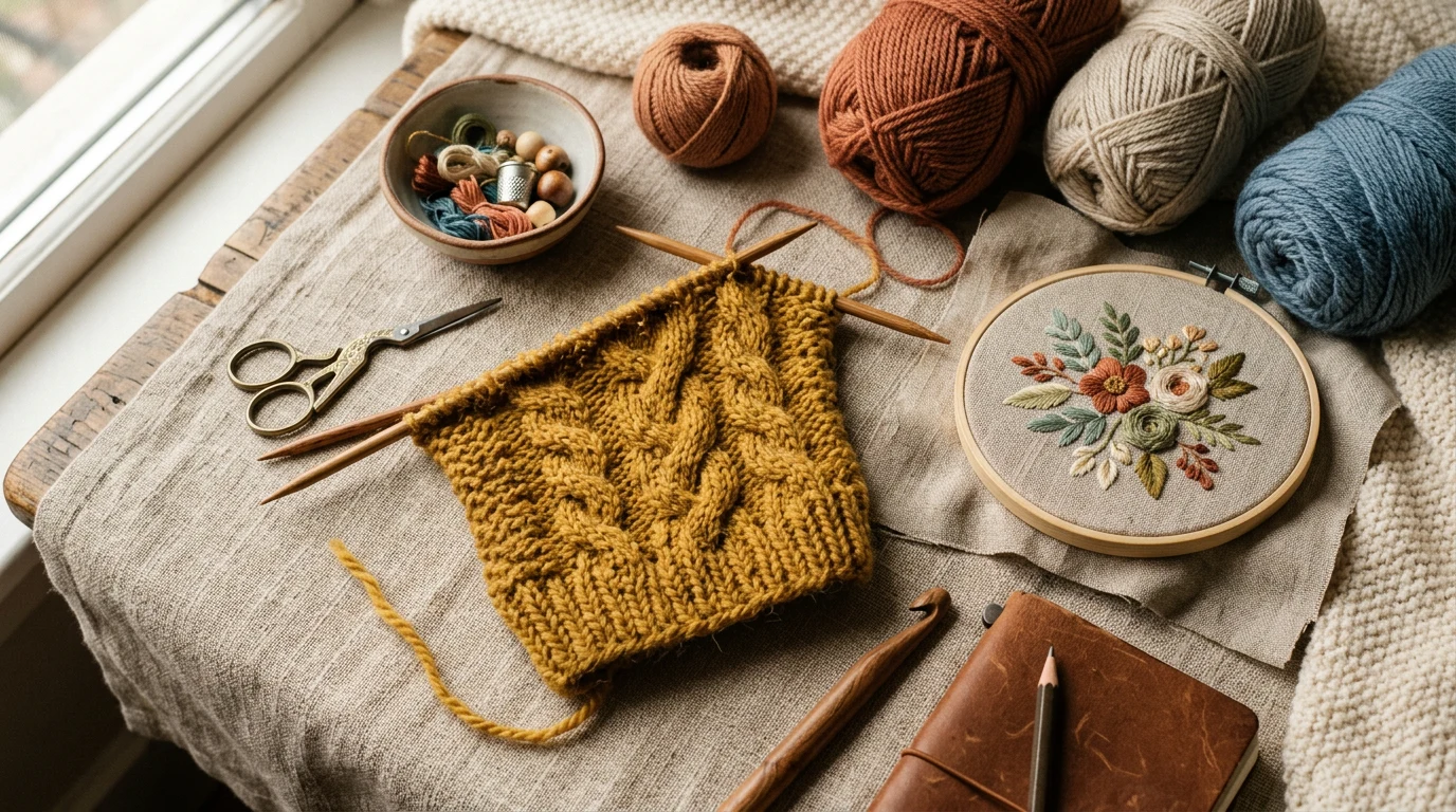
There’s something truly magical about receiving a hand-addressed envelope in your mailbox. In our digital age, calligraphy envelope addressing has become a cherished art that adds elegance and personal touch to wedding invitations, holiday cards, and special correspondence. Whether you’re planning your daughter’s wedding or want to make your holiday greetings extra special, learning this beautiful skill will bring joy to both you and your recipients.
Our reviews are based on aggregated verified buyer feedback, manufacturer specifications, and published expert opinion. Products are not independently tested by our team.
Why Hand-Addressed Envelopes Make an Impact
Hand-addressed envelopes create an immediate impression of thoughtfulness and care. When someone receives beautifully lettered mail, they know the sender took time to make their correspondence special. This personal touch has become increasingly rare and valuable in our fast-paced world.

Calligraphy envelope addressing serves multiple purposes beyond mere aesthetics. It conveys respect for the recipient, elevates the importance of the contents, and creates anticipation before the envelope is even opened. For formal events like weddings, graduations, or milestone celebrations, hand-lettered addresses signal the significance of the occasion.
The psychological impact shouldn’t be underestimated either. Recipients often save beautifully addressed envelopes as keepsakes, and many report feeling honored to receive such carefully crafted mail. This emotional connection transforms simple correspondence into meaningful communication that strengthens relationships and creates lasting memories.
From a practical standpoint, well-executed calligraphy on envelopes also ensures better mail delivery. Clear, legible addressing reduces the chance of postal errors, while the distinctive appearance makes your mail less likely to be discarded as junk mail.
Best Envelopes for Calligraphy
Choosing the right envelope is crucial for successful calligraphy addressing. The paper quality, texture, and color all affect how your ink will perform and how your lettering will appear. Understanding these factors will help you select envelopes that showcase your calligraphy beautifully.
Paper weight matters significantly when selecting envelopes for calligraphy. Heavier papers, typically 24 to 32 pound weight, provide better ink absorption and prevent bleeding. Lightweight papers may cause your ink to feather or spread unpredictably, compromising your lettering quality. Many calligraphers prefer cotton or cotton-blend papers for their superior texture and ink handling properties.
Texture plays an important role in both appearance and functionality. Smooth papers work well with most calligraphy tools and provide consistent ink flow. Slightly textured papers can add visual interest but may catch on certain nibs. Avoid heavily textured or rough papers for beginners, as they can be challenging to write on and may cause skipping or uneven lines.
Standard envelope sizes offer different advantages for calligraphy projects. A7 envelopes (5.25″ x 7.25″) provide ample space for addressing and decorative elements, making them popular for wedding invitations. A6 envelopes (4.75″ x 6.5″) work well for smaller invitations and greeting cards, while #10 business envelopes suit formal correspondence.
Color considerations extend beyond aesthetics to practical concerns. Light-colored envelopes provide the best contrast for most inks, while dark envelopes require special white or metallic inks that may be more challenging to work with. Cream, ivory, and soft pastels offer elegant alternatives to pure white while maintaining good readability.
Ink Choices for Different Envelope Colors
Selecting the appropriate ink for your envelope color is essential for achieving professional-looking results. Different inks behave differently on various papers, and understanding these characteristics will help you make informed choices for your calligraphy projects.
For light-colored envelopes, traditional fountain pen inks offer excellent results. Sumi ink by Kuretake provides rich, deep blacks that flow smoothly and dry quickly. This high-quality ink works particularly well with dip pens and creates crisp, clean lines. Many calligraphers appreciate its consistency and permanence, making it ideal for important correspondence.
When working with colored envelopes, consider how your ink choice will affect readability and visual appeal. Navy blue ink on cream envelopes creates an elegant, sophisticated look, while brown ink on ivory provides a warm, vintage feeling. Always test your ink on a sample piece of the same paper before beginning your project.
Dark envelopes present unique challenges and opportunities. White gouache mixed with water creates opaque coverage that shows beautifully on dark papers. Metallic inks in gold, silver, or copper add luxury and festivity to special occasion mailings. However, these specialty inks often require different application techniques and may need longer drying times.
The Pentel Fude Touch Sign Pen offers convenience for beginners working on light to medium-colored envelopes. This brush pen provides consistent ink flow and allows for varied line weights without the complexity of dip pens. While not traditional for formal calligraphy, it’s excellent for practice and casual projects.
Consider environmental factors when choosing inks. If your envelopes will be exposed to moisture or handling, waterproof inks ensure your addressing remains legible. Archival inks resist fading and provide longevity for keepsake correspondence that recipients may preserve.

Layout and Spacing Guidelines
Proper layout and spacing separate amateur addressing from professional-quality calligraphy. Understanding how to position your text creates visual balance and ensures your addressing looks polished and intentional. These guidelines will help you achieve consistent, attractive results across all your envelopes.
Begin by establishing guidelines using light pencil marks or a ruler. The recipient’s name typically appears about one-third down from the top of the envelope, centered horizontally. This positioning allows adequate space for postal markings while maintaining visual balance. Use your Rhodia dot pad to practice spacing before working on actual envelopes.
Line spacing should be consistent throughout your addressing. Generally, allow about 1.5 to 2 times your letter height between lines. This spacing ensures readability while preventing a cramped appearance. For formal addressing, slightly more generous spacing conveys elegance and importance.
Horizontal alignment depends on your chosen style and the envelope’s purpose. Centered alignment works well for formal invitations and creates a classical, balanced appearance. Left-aligned text appears more modern and is easier to execute consistently, especially for beginners. Avoid right alignment for addressing, as it can appear awkward and may confuse postal workers. For more guidance, JetPens provides expert resources on calligraphy pens.
Return address placement follows postal guidelines while accommodating your design preferences. The upper left corner remains the standard position, but you can also place return addresses on the back flap for a cleaner front appearance. Ensure return addresses are smaller than the main addressing to maintain proper visual hierarchy.
| Element | Position | Size Relative to Main Address |
|---|---|---|
| Recipient Name | Center, 1/3 from top | 100% |
| Street Address | Center, below name | 90-95% |
| City, State, ZIP | Center, bottom line | 90-95% |
| Return Address | Upper left or back flap | 70-80% |
Margins around your addressing prevent crowding and allow for postal markings. Leave at least one inch from all edges, with extra space on the right side for postage placement. These margins also provide buffer space if your lettering drifts slightly during writing.
Formal vs Informal Addressing
Understanding the distinction between formal and informal addressing styles helps you match your calligraphy to the occasion’s tone and recipient’s expectations. Each approach serves different purposes and follows specific conventions that convey appropriate levels of respect and familiarity.
Formal addressing follows traditional etiquette rules and uses complete titles, full names, and proper abbreviations. Wedding invitations, business correspondence, and official announcements typically require formal addressing. This style uses titles like “Mr. and Mrs.,” “Dr.,” or “The Honorable” along with full given names rather than nicknames.
The language of formal addressing includes specific phrases and structures. “Mr. and Mrs. John Robert Smith” represents traditional married couple addressing, while modern alternatives include “Mr. John Smith and Mrs. Mary Johnson” for couples with different surnames. Professional titles take precedence over social titles when applicable.
Informal addressing allows for more personal touches and relaxed conventions. Holiday cards, birthday invitations, and casual correspondence can use first names, nicknames, or family designations like “The Smith Family.” This approach creates warmth and intimacy appropriate for close relationships.
Script choice often reflects the formality level of your addressing. Copperplate, Spencerian, and other traditional scripts suit formal occasions and convey elegance and tradition. Modern calligraphy styles, brush lettering, and casual scripts work well for informal addressing and contemporary events.
Consider your relationship with the recipient when choosing between formal and informal approaches. Professional contacts, distant relatives, and elderly recipients may appreciate formal addressing, while close friends and contemporary peers might prefer more casual styles. When in doubt, err on the side of formality, especially for significant events.
Step-by-Step Envelope Addressing
Following a systematic approach to envelope addressing ensures consistency and reduces errors across your entire project. This step-by-step process works whether you’re addressing wedding invitations or holiday cards, providing a framework for successful calligraphy every time.
Begin with proper workspace preparation. Ensure good lighting, preferably natural light or a quality desk lamp that eliminates shadows. Position your envelope at a comfortable angle, typically about 45 degrees if you’re using an oblique pen holder like the Speedball Oblique Pen Holder. Have all your materials within easy reach, including extra envelopes for practice and potential mistakes.
Start by lightly penciling guidelines on your envelope. Use a ruler and hard pencil (2H or 3H) to mark baseline positions for each line of addressing. These guidelines should be barely visible and easily erasable after completion. Some calligraphers create a template that slides inside the envelope to show through thin papers.
Prepare your writing instrument carefully. If using a dip pen with a Nikko G nib or Zebra G nib, ensure proper ink loading without overflow. Test your pen on scrap paper to verify smooth ink flow and appropriate line weight. The Pilot Parallel Pen offers convenience for beginners but still requires proper preparation and testing.
Write the recipient’s name first, positioning it according to your layout plan. Focus on consistent letter spacing and maintaining your baseline. Take your time with each letter, as rushing often leads to inconsistencies that become more apparent when multiplied across many envelopes.
- Write the recipient’s name on the first line
- Add the street address on the second line
- Complete with city, state, and ZIP code on the third line
- Add return address in designated position
- Allow ink to dry completely before handling
- Carefully erase pencil guidelines
Complete each line before moving to the next, maintaining consistent spacing and alignment. The street address should align with your chosen format, whether centered or left-aligned. City, state, and ZIP code typically appear on the final line, with proper spacing between elements.
Add the return address last, using a smaller size that maintains legibility while creating proper visual hierarchy. Whether placing it in the upper left corner or on the back flap, ensure it follows the same quality standards as your main addressing.
Allow adequate drying time before handling your completed envelopes. Some inks require several minutes to set completely, and handling too soon can cause smudging. Consider using blotting paper or allowing extra time for metallic or specialty inks.
- 14K gold flex nib
- Soft-medium point
- Resin barrel gold trim
Adding Decorative Flourishes
Decorative flourishes can transform simple envelope addressing into miniature works of art. These elegant additions require restraint and skill to enhance rather than overwhelm your lettering. Understanding when and how to add flourishes will elevate your calligraphy envelope addressing while maintaining professionalism and readability.
Flourishes work best when they serve the overall design rather than competing with the addressing itself. Simple underlines beneath names, graceful ascender loops, or subtle descender swashes can add elegance without compromising legibility. The key is maintaining balance between decoration and function.
Consider the occasion when planning decorative elements. Wedding invitations might benefit from romantic swirls and delicate flourishes, while business correspondence requires more restrained decoration. Holiday cards allow for seasonal motifs, such as holly leaves or snowflake-inspired elements, incorporated into your lettering.
Tombow Dual Brush Pens offer excellent control for adding colored flourishes or highlighting elements. Their flexible tips allow for varied line weights that complement traditional calligraphy while providing color options that enhance your design. Practice flourish techniques on Canson Marker paper before applying them to final envelopes.
Timing is crucial when adding flourishes. Some calligraphers prefer to complete all basic lettering first, then add decorative elements. Others incorporate flourishes as they write. Choose the approach that gives you better control and consistency across your project.
Common flourish locations include:
- Underneath the recipient’s name as an elegant underline
- Extending from the first or last letters of names
- Connecting elements between words
- Framing the entire address block
- Incorporating small motifs in corners or margins
Practice restraint to avoid over-decoration. A single well-placed flourish often has more impact than multiple competing elements. Remember that your addressing must remain easily readable by both recipients and postal workers. According to the United States Postal Service, addressing should be clear and unobstructed for proper mail delivery.
Color coordination between your ink and any decorative elements creates cohesive, professional results. Monochromatic schemes using different shades of the same color often work better than multiple contrasting colors, which can appear chaotic on small envelope surfaces.
Common Mistakes and How to Fix Them
Learning from common mistakes accelerates your progress in calligraphy envelope addressing. Most errors fall into predictable categories, and understanding how to prevent and correct them will improve your results and boost your confidence. Many of these issues can be addressed through proper preparation and technique adjustment.
Inconsistent spacing ranks among the most frequent problems in envelope addressing. This occurs when calligraphers don’t establish proper guidelines or fail to maintain consistent letter and word spacing throughout their work. The solution involves using light pencil guidelines and practicing consistent spacing on practice paper before working on final envelopes.
Ink bleeding and feathering often result from incompatible ink and paper combinations or overloaded pens. Test your ink on envelope scraps before beginning your project. If bleeding occurs, try a different ink formulation or switch to higher-quality paper. The Brause Steno nib (Blue Pumpkin) provides excellent ink control for calligraphers struggling with flow issues.
Poor baseline alignment creates an unprofessional appearance even when individual letters look good. This problem typically stems from inadequate guidelines or rushing through the addressing process. Always use light pencil guidelines and take time to align each letter properly with the baseline.
Smudging happens when ink hasn’t dried completely or when hands drag across wet lettering. Left-handed calligraphers face particular challenges with smudging. Solutions include using faster-drying inks, working from right to left when possible, and using a guard sheet to protect completed work.
Overcrowding occurs when calligraphers try to fit too much information in limited space or use lettering that’s too large for the envelope size. Plan your layout carefully, considering all address elements and their relative sizes. Practice complete addresses on scrap paper to verify proper fit before working on final envelopes.
- Start with shorter practice addresses to build confidence
- Keep extra envelopes available for inevitable mistakes
- Work in good lighting to spot problems early
- Take breaks to maintain steady hand control
- Use consistent pressure throughout your addressing
- Allow adequate time for each envelope rather than rushing
Letter formation inconsistencies develop when calligraphers haven’t sufficiently practiced their chosen script. Each letter should maintain consistent style, size, and slant throughout the project. Regular practice sessions focusing on specific letterforms will improve consistency over time.
Recovery techniques for mistakes depend on the error type and how far you’ve progressed. Minor errors might be correctable with careful touch-ups, while major mistakes typically require starting over with a new envelope. Building extra envelopes into your project planning accommodates inevitable errors without causing stress or delays.
Frequently Asked Questions
What type of pen is best for addressing envelopes?
The best pen depends on your skill level and project requirements. Beginners often find success with the Pilot Parallel Pen, which provides consistent ink flow and doesn’t require frequent reloading. More experienced calligraphers prefer dip pens with nibs like the Nikko G or Zebra G for greater control and traditional results. For casual projects, the Pentel Fude Touch Sign Pen offers convenience without compromising quality.
How do I prevent ink from bleeding on envelopes?
Prevent ink bleeding by choosing appropriate paper and ink combinations. Heavier weight papers (24-32 lb) with cotton content handle ink better than thin, wood-pulp papers. Test your ink on envelope samples before beginning your project. Sumi ink by Kuretake works well on most quality papers and provides excellent control. Avoid overloading your pen with ink, and use light, consistent pressure when writing.
Should I use guidelines when addressing envelopes?
Yes, guidelines are essential for professional-looking results. Use a hard pencil (2H or 3H) to lightly mark baseline positions for each line of addressing. These guidelines should be barely visible and easily erasable after completion. Some calligraphers create reusable templates that slide inside envelopes for consistent positioning across multiple pieces.
How long should I let the ink dry before handling envelopes?
Drying time varies by ink type and environmental conditions. Standard fountain pen inks typically dry within 30-60 seconds, while specialty inks like metallics or gouache may require 2-5 minutes. Test drying time on scrap paper in your working conditions. Humid weather extends drying time, while low humidity and good air circulation speed the process. Always err on the side of caution to avoid smudging.
Can I address dark-colored envelopes with regular ink?
Regular black or colored inks don’t show well on dark envelopes. For dark papers, use white gouache thinned with water, or specialized white/metallic inks designed for dark surfaces. These inks require different handling techniques and often need longer drying times. Practice on dark paper samples first, as the opacity and flow characteristics differ significantly from standard inks.
How many envelopes should I practice on before starting my final project?
Practice on at least 10-15 complete addresses using the same materials you’ll use for your final project. This practice helps you establish consistent spacing, timing, and technique. For large projects like wedding invitations, consider practicing until you can complete 5 consecutive envelopes without significant errors. Always have 10-15% extra envelopes beyond your actual need to account for inevitable mistakes.
What’s the proper way to hold a calligraphy pen for envelope addressing?
Hold your pen at approximately a 45-degree angle to the paper, with the nib positioned consistently for your chosen script. For oblique scripts, use an oblique pen holder like the Speedball Oblique Pen Holder to maintain proper angles without straining your wrist. Keep your grip relaxed but controlled, allowing for smooth movement across the paper. Your arm should do most of the movement rather than just your fingers.
How do I address envelopes to couples with different last names?
For couples with different surnames, write each name on a separate line or use “Mr. John Smith and Ms. Mary Johnson” on one line if space permits. List names alphabetically by last name, or put the person you know better first. For same-sex couples, follow the same conventions. Avoid outdated forms like “Mr. and Mrs. John Smith” when the wife has a different surname.
Frequently Asked Questions
Do I need special training to start addressing envelopes with calligraphy?
No special training is required to begin learning calligraphy envelope addressing. With basic calligraphy supplies like a calligraphy pen and ink, along with practice and patience, you can develop this beautiful skill at your own pace. Many seniors find that starting with simple strokes and practicing regularly helps you build confidence and improve your technique over time.
What supplies do I need to get started with calligraphy addressing?
You’ll need calligraphy pens (available in various nib widths), calligraphy ink, quality envelopes or cardstock, and practice paper. Many beginners also benefit from having a guide sheet or template underneath their envelope to help maintain consistent letter spacing and alignment. These supplies are affordable and readily available at craft stores or online retailers.
Is hand-addressed calligraphy really worth the time investment?
Yes, the time investment is absolutely worthwhile because recipients often treasure beautifully addressed envelopes as keepsakes and feel genuinely honored to receive such thoughtfully crafted mail. Hand-addressed envelopes create an emotional connection that strengthens relationships and transform simple correspondence into meaningful communication that leaves lasting impressions on your loved ones.
Can I use calligraphy addressing for everyday occasions or just formal events?
You can use calligraphy addressing for any occasion you’d like to make special, from holiday cards and birthday greetings to thank-you notes and friendly correspondence. While it’s traditionally associated with formal events like weddings and graduations, adding this personal touch to everyday mail makes your recipients feel valued and creates a unique, memorable experience.
