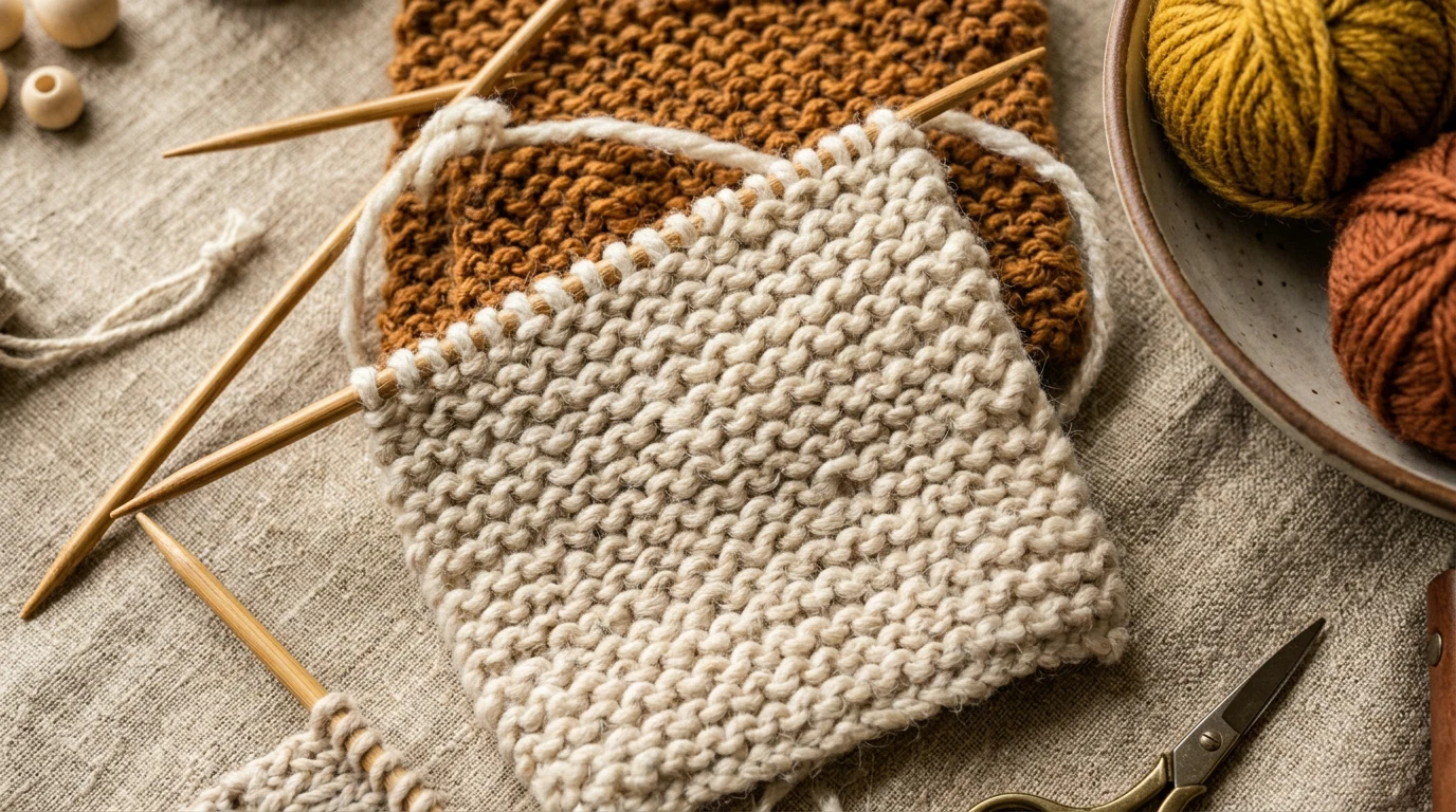
Modern calligraphy for beginners opens up a world of beautiful lettering that’s both relaxing and rewarding. Unlike traditional calligraphy with its strict rules and formal structure, modern calligraphy embraces personal style and creative expression while maintaining the elegant foundation of beautiful letterforms.
Our reviews are based on aggregated verified buyer feedback, manufacturer specifications, and published expert opinion. Products are not independently tested by our team.
What Is Modern Calligraphy?
Modern calligraphy breaks free from the rigid constraints of traditional scripts, allowing for personal interpretation and creative flourishes. This contemporary approach to beautiful lettering combines the fundamental principles of traditional calligraphy with modern design sensibilities and individual expression.
The key difference lies in flexibility. While traditional calligraphy follows specific historical scripts like Copperplate or Spencerian with precise angles and letter spacing, modern calligraphy encourages you to develop your own style. You might vary your letter slant, add decorative elements, or play with spacing to create unique compositions.

Modern calligraphy maintains the core principle of thick and thin strokes created by pressure variation. When you press down on your pen, you create thick downstrokes. Light pressure produces thin upstrokes. This fundamental contrast creates the elegant rhythm that makes calligraphy so visually appealing.
What makes modern calligraphy particularly appealing for beginners is its forgiving nature. Small imperfections aren’t mistakes – they’re character. The slightly uneven baselines and varied letter heights that might be errors in traditional calligraphy often add charm to modern pieces.
This art form has gained tremendous popularity for wedding invitations, hand-lettered quotes, bullet journaling, and personal stationery. The International Association of Master Penmen, Engrossers and Teachers of Handwriting notes that modern calligraphy has become one of the most accessible entry points into the lettering arts.
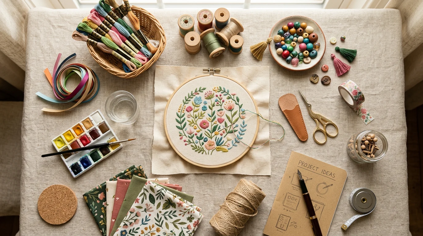
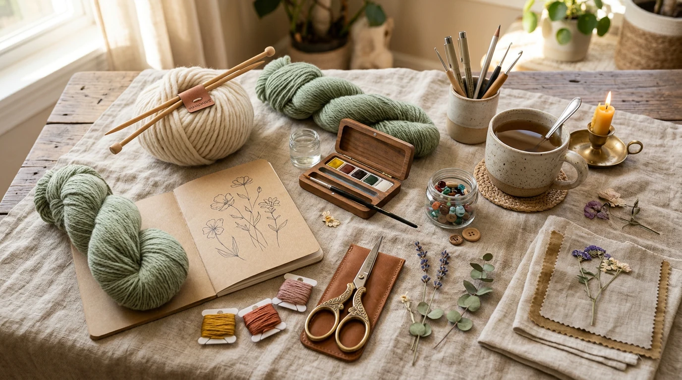
Essential Calligraphy Supplies
Starting with quality supplies sets you up for success in modern calligraphy. While you don’t need expensive equipment, choosing the right tools makes learning easier and more enjoyable. Let’s explore the essential supplies every beginner needs.
Your basic toolkit includes a pen holder, nibs, ink, and paper. Many beginners find success starting with brush pens before transitioning to traditional dip pens. Brush pens like the Tombow Dual Brush Pens offer convenience and instant ink flow without the learning curve of dip pens.
For those ready to try traditional tools, the Pilot Parallel Pen provides an excellent middle ground. This fountain pen-style tool has a broad, flat nib that creates beautiful thick and thin strokes without requiring dipping. Reviewers consistently praise its smooth ink flow and beginner-friendly design.
Traditional dip pens offer the most authentic calligraphy experience. A basic setup includes an oblique pen holder, several nibs in different sizes, and high-quality ink. The Speedball Oblique Pen Holder receives excellent reviews for its comfortable grip and proper angle for modern calligraphy scripts.
- Pen holder (oblique preferred for modern scripts)
- Assorted nibs (start with medium flexibility)
- High-quality ink or brush pens
- Practice paper with guidelines
- Ruler and pencil for guidelines
- Paper towels or cloth for cleaning
- Water container for cleaning nibs
Consider starting with a calligraphy starter kit that includes multiple tools. This approach lets you experiment with different writing instruments to find your preference without investing heavily in individual items.
Understanding Nibs and Pen Holders
The relationship between your nib and pen holder determines your writing experience. Understanding how these components work together helps you make informed choices and troubleshoot common issues.
Nibs come in various materials and flexibility levels. Steel nibs offer durability and consistent performance, making them ideal for beginners. The Nikko G nib stands out as a favorite among calligraphers for its smooth writing and moderate flexibility. Buyers consistently report that this nib provides excellent line variation without being too sensitive to pressure changes.
The Zebra G nib offers slightly more flexibility, creating dramatic thick and thin variations with pressure changes. Reviewers note that while it requires a gentler touch than the Nikko G, it produces beautiful expressive lines once you master the pressure control.
For those seeking maximum line variation, the Brause Steno nib (Blue Pumpkin) provides exceptional flexibility. This nib responds to the slightest pressure changes, creating everything from hairline thin strokes to bold thick lines. However, buyers recommend gaining experience with stiffer nibs before attempting this highly responsive option.
| Nib Type | Flexibility | Best For | Skill Level |
|---|---|---|---|
| Nikko G | Medium | Consistent line variation | Beginner to Advanced |
| Zebra G | Medium-High | Expressive letterforms | Intermediate |
| Brause Steno | Very High | Dramatic contrast | Advanced |
Pen holders come in straight and oblique styles. Oblique holders angle the nib to create the proper writing position for modern calligraphy scripts. The Speedball Oblique Pen Holder features an adjustable brass flange that accommodates different nib sizes and personal preferences.
Proper nib insertion prevents frustration and damaged equipment. The nib should fit snugly into the holder without wobbling, but not so tightly that it bends during insertion. Most holders accommodate standard-sized nibs, but always check compatibility before purchasing.
Maintenance keeps your nibs performing well. Clean nibs with water after each use, removing all ink residue. Store nibs in a dry location to prevent rust. Replace nibs when they become scratchy or fail to hold ink properly.
Choosing Ink for Calligraphy
Ink quality significantly impacts your calligraphy results. The right ink flows smoothly from your nib, creates rich color, and dries without smudging. Understanding different ink types helps you choose the best option for your projects and skill level.
Traditional fountain pen inks work well for practice and everyday calligraphy. These inks flow easily and clean up with water, making them beginner-friendly. However, they may not provide the richest color density for finished pieces.
Sumi ink by Kuretake receives excellent reviews from calligraphers for its deep black color and smooth flow. This traditional Japanese ink produces crisp, dark lines that photograph beautifully. Buyers report that it flows consistently from nibs without clogging or skipping.
Acrylic inks offer vibrant colors and permanent results once dry. These inks work well for finished pieces but require more careful cleanup since they’re not water-soluble after drying. They tend to be thicker than fountain pen inks, which some calligraphers prefer for bold, opaque coverage.
India ink provides excellent coverage and archival quality but can be challenging for beginners. It tends to dry quickly and may clog nibs if not cleaned promptly. Start with more forgiving inks before progressing to India ink.
- Start with fountain pen ink for practice
- Choose high-quality sumi or India ink for finished pieces
- Consider acrylic inks for colored projects
- Test ink flow on practice paper first
- Clean nibs immediately after use
- Store ink properly to prevent contamination
Consistency matters more than brand when starting out. Choose one ink type and master it before experimenting with others. This approach helps you understand how ink behaves with your chosen nibs and writing style.

Paper for Practice and Projects
The right paper makes learning modern calligraphy easier and more enjoyable. Paper texture, absorbency, and guideline systems all influence your writing experience and results.
Smooth paper works best for calligraphy because it allows nibs to glide without catching on fibers. Textured papers may look appealing but can cause skipping and inconsistent ink flow, especially with fine nibs.
The Rhodia dot pad has become a favorite among calligraphers for practice work. Its smooth surface provides excellent ink flow, while the subtle dot grid helps maintain consistent letter sizing and spacing. Buyers appreciate that the dots are light enough not to interfere with finished pieces but visible enough for guidance.
For marker-based practice, Canson Marker paper prevents ink from bleeding through while maintaining smooth writing. This paper works particularly well with brush pens like the Tombow Dual Brush Pens or Pentel Fude Touch Sign Pen.
Copy paper works for initial practice but may frustrate beginners due to ink bleeding and feathering. Invest in quality practice paper once you’re committed to learning. The improved writing experience justifies the modest additional cost. For more guidance, IAMPETH provides expert resources on penmanship standards.
Guidelines are crucial for consistent lettering. Many calligraphers create their own guideline sheets that can be placed under translucent practice paper. This system provides consistent spacing while allowing you to use your preferred paper type.
- Choose smooth, non-absorbent paper
- Start with dot grid or lined practice pads
- Use marker paper for brush pen practice
- Create reusable guideline sheets
- Test paper with your chosen ink first
- Keep different papers for practice and finished work
Paper weight affects ink behavior and durability. Heavier papers handle wet inks better and resist curling, but they’re more expensive for practice. Reserve premium papers for final projects and use good-quality practice papers for skill development.
Basic Strokes: The Foundation
Mastering basic strokes forms the foundation of beautiful modern calligraphy. These fundamental movements train your hand to create consistent thick and thin lines while developing the muscle memory necessary for fluid letter formation.
The basic stroke is a simple downstroke with pressure variation. Start light, increase pressure gradually to create thickness, then release pressure as you complete the stroke. This creates the classic thick-to-thin transition that defines calligraphy.
Practice upstrokes with light, consistent pressure. These connecting strokes should be thin and barely visible. The contrast between thick downstrokes and thin upstrokes creates the rhythm and elegance of modern calligraphy.
Curved strokes require smooth pressure transitions while maintaining consistent curves. Start with simple C-shapes, practicing both left-facing and right-facing curves. These strokes form the basis for many letters including a, c, d, g, o, and q.
Oval shapes combine curved strokes with consistent width and height. Practice making ovals of different sizes while maintaining proper proportions. The ability to create consistent ovals translates directly to better letter spacing and overall composition.
- Downstrokes: Apply pressure for thick lines
- Upstrokes: Light pressure for thin lines
- Curves: Smooth pressure transitions
- Ovals: Consistent shape and proportion
- Connecting strokes: Light, flowing movements
- Loops: Controlled circles and partial circles
Loop formations appear in many modern calligraphy letters. Practice clockwise and counterclockwise loops of various sizes. Start large and gradually work smaller as your control improves. Consistent loop sizes contribute significantly to professional-looking lettering.

Spend at least 15 minutes daily on basic stroke practice. This dedicated practice time develops the fine motor control and muscle memory essential for beautiful lettering. Many experienced calligraphers continue daily stroke practice to maintain their skills.
Focus on consistency rather than speed. Slow, controlled movements produce better results than rushed strokes. Speed naturally increases as your muscle memory develops, but control must come first.
Lowercase Letter Forms
Lowercase letters form the backbone of modern calligraphy. These letters appear most frequently in writing, making their consistent formation crucial for beautiful finished pieces. Understanding the basic structure and stroke sequence for each letter group accelerates learning.
Letters divide into families based on similar stroke patterns. The oval family (a, c, d, g, o, q) shares the fundamental oval shape with varying additional strokes. Master the basic oval first, then add the distinguishing elements for each letter.
The letter ‘a’ begins with an oval, followed by a downstroke that starts at the top right of the oval and extends down with an upturn at the bottom. This upturn creates the connection point for the next letter in word formation.
Ascender letters (b, d, f, h, k, l, t) extend above the main letter height. These letters require careful proportion control. The ascender should be approximately 1.5 to 2 times the height of the main letter body, depending on your chosen style.
Descender letters (g, j, p, q, y, z) extend below the baseline. Like ascenders, these elements need consistent proportioning. The descender length typically matches the ascender length for balanced appearance.
| Letter Group | Key Characteristics | Practice Focus |
|---|---|---|
| Oval Family (a,c,d,g,o,q) | Consistent oval shapes | Smooth curves, consistent width |
| Ascenders (b,d,f,h,k,l,t) | Extend above x-height | Proportional height, consistent slant |
| Descenders (g,j,p,q,y,z) | Extend below baseline | Balanced proportions, smooth curves |
| Standard (e,i,m,n,r,s,u,v,w,x) | Stay within x-height | Consistent spacing, proper connections |
Letter spacing requires as much attention as individual letter formation. Modern calligraphy allows for varied spacing, but consistency within words maintains readability. Practice writing the same word multiple times, adjusting spacing until it looks balanced.
The letters ‘m’ and ‘n’ establish rhythm patterns that carry through entire words. These letters contain the basic arch stroke that appears in many other letters. Perfect your ‘m’ and ‘n’ formation to improve overall consistency.
Challenging letters like ‘s’ and ‘z’ require patient practice. The letter ‘s’ combines curves flowing in opposite directions, requiring smooth transitions. Break complex letters into component strokes and practice each element separately before combining them.
Uppercase Letter Forms
Uppercase letters in modern calligraphy offer opportunities for creative flourishing while maintaining readability. These letters typically appear less frequently than lowercase, allowing for more decorative elements and personal style expression.
Capital letters generally maintain larger proportions than lowercase, typically 1.5 to 2 times the height of lowercase letters. This proportion creates visual hierarchy and proper emphasis in finished pieces.
The letter ‘A’ demonstrates fundamental uppercase construction. Begin with an upstroke to the peak, then create the thick downstroke on the right side. The crossbar connects these strokes at approximately one-third the height from the bottom. This proportion creates balanced visual weight.
Circular uppercase letters (C, G, O, Q) require consistent curve formation at larger sizes. The increased size makes imperfections more visible, demanding careful attention to smooth pressure transitions and symmetrical shapes.
Letters with horizontal elements (E, F, H, T) need consistent weight distribution. The horizontal strokes should be slightly thinner than the main vertical strokes to prevent the letter from appearing top-heavy.
Flourished capitals add elegance to modern calligraphy but require restraint. Simple extensions and curves enhance letters without overwhelming the overall composition. Practice basic letter forms before adding decorative elements.
- Maintain consistent proportions across all capitals
- Practice basic forms before adding flourishes
- Keep decorative elements balanced and purposeful
- Ensure readability remains the priority
- Study exemplars from established calligraphers
- Practice capitals in context with complete words
The letters ‘S’ and ‘R’ often challenge beginners due to their complex curves and multiple direction changes. Break these letters into segments, practicing each curve separately before attempting the complete letter.
Consistent slant angle unifies uppercase letters with your lowercase alphabet. Most modern calligraphy styles use a slant between 52-55 degrees from vertical, though personal style may vary this slightly.
- 14K gold flex nib
- Soft-medium point
- Resin barrel gold trim
Connecting Letters Into Words
Transforming individual letters into flowing words requires understanding connection principles and developing rhythm in your writing. Successful word formation balances legibility with the flowing nature of cursive letterforms.
Most lowercase letters connect at the baseline through thin upstrokes. These connecting strokes should flow naturally from the ending stroke of one letter to the beginning stroke of the next. Practice common letter combinations to develop muscle memory for frequent patterns.
Some letters don’t connect naturally in modern calligraphy. Letters ending with downstrokes (like ‘g’, ‘j’, ‘p’, ‘y’, ‘z’) often lift before the next letter. This creates natural breaks that add visual interest and improve readability.
Word spacing requires careful balance. Words should be close enough to read as units but far enough apart to prevent visual crowding. A general rule suggests spacing words approximately one lowercase ‘o’ apart, though modern calligraphy allows for stylistic variation.
Letter combinations like ‘oo’, ‘tt’, and ‘ss’ need special attention to prevent awkward spacing or overlapping. Practice these common combinations until they flow naturally within words.
The word ‘minimum’ serves as an excellent practice word for developing rhythm and consistency. It contains multiple repeated letters that reveal inconsistencies in formation and spacing. Regular practice with this word improves overall writing quality.
- Practice common letter combinations repeatedly
- Maintain consistent baseline and x-height
- Allow natural breaks between certain letters
- Balance word spacing for readability
- Focus on rhythm and flow over individual perfection
- Practice with pangrams to encounter all letter combinations
Pangrams like “The quick brown fox jumps over the lazy dog” provide practice with every letter of the alphabet within natural word contexts. Regular pangram practice helps identify letters that need additional attention.
Maintaining consistent baseline while writing full words challenges beginners. Draw light guidelines or use lined practice paper until you develop the muscle memory for straight writing.
Your First Calligraphy Project
Completing your first calligraphy project provides motivation and demonstrates your progress. Choose a simple project that showcases your developing skills without overwhelming your current abilities.
A favorite quote or meaningful phrase makes an excellent first project. Choose text with 3-5 words to keep the project manageable while providing enough content to demonstrate your lettering skills. Avoid overly complex phrases or those with many challenging letter combinations.
Begin with thumbnail sketches to plan your composition. Consider how the text will fit on your chosen paper size and experiment with different layouts. Will you center the text, create multiple lines, or arrange it in a creative shape?
Create guidelines on your final paper using light pencil marks. These guides help maintain consistent letter size and baseline positioning throughout your project. Most guidelines can be erased after completion.
Write your project text on practice paper first. This rehearsal identifies potential spacing issues or challenging letter combinations before you begin the final piece. Make notes about spacing and letter sizing for reference.
Execute your project slowly and deliberately. Focus on consistent letter formation rather than speed. Take breaks if your hand becomes tired, as fatigue leads to decreased consistency and control.
- Choose meaningful text of appropriate length
- Plan composition with thumbnail sketches
- Practice on scrap paper first
- Create clear guidelines for consistency
- Work slowly and take breaks as needed
- Focus on your best lettering rather than speed
Consider simple decorative elements like underlines or flourishes, but avoid overcomplicating your first project. Clean, well-executed letterforms impress more than overly decorated pieces with inconsistent lettering.
Document your first project with photographs. This creates a reference point for tracking your improvement over time. Many calligraphers are amazed at their progress when comparing early work to later pieces.
Common Beginner Mistakes to Avoid
Learning from common mistakes accelerates your calligraphy progress and prevents frustrating setbacks. Understanding these pitfalls helps you develop good habits from the beginning rather than correcting bad habits later.
Gripping the pen too tightly creates tension that affects stroke quality and causes hand fatigue. Hold your pen firmly enough for control but relaxed enough to allow fluid movement. Regular practice helps develop the proper grip pressure naturally.
Inconsistent slant angle disrupts the visual flow of words and phrases. Establish your preferred slant angle early and practice maintaining it throughout entire pieces. Guidelines angled to match your slant help maintain consistency.
Rushing through practice sessions leads to sloppy habits and reinforces poor technique. Quality practice time, even if brief, produces better results than lengthy sessions without focus. Concentrate on perfecting individual elements rather than attempting complex pieces prematurely.
Neglecting basic stroke practice in favor of jumping directly to letters hampers long-term progress. Daily stroke practice, even for experienced calligraphers, maintains consistency and control. These fundamentals support all advanced techniques.
Using inappropriate paper or ink combinations creates unnecessary challenges. Bleeding ink, scratchy paper, or incompatible materials make learning more difficult. Invest in quality supplies suited to your skill level and chosen techniques.
- Avoid gripping the pen too tightly
- Maintain consistent slant angles
- Practice slowly with focus rather than speed
- Continue daily basic stroke practice
- Use appropriate paper and ink combinations
- Don’t skip fundamental exercises for complex projects
- Avoid comparing your progress to others
Comparing your beginner work to expert exemplars discourages progress and creates unrealistic expectations. Every calligrapher began with imperfect letters and gradually developed their skills through consistent practice. Focus on personal improvement rather than external comparisons.
Ignoring proper posture and workspace setup leads to fatigue and inconsistent results. Sit upright with your paper at a slight angle, ensure adequate lighting, and position your materials for easy access. A comfortable setup enables longer, more productive practice sessions.
Modern calligraphy for beginners offers a rewarding creative outlet that combines artistic expression with practical applications. The journey from basic strokes to beautiful finished pieces requires patience, practice, and persistence, but the satisfaction of creating elegant lettering makes the effort worthwhile. Start with quality supplies, focus on fundamentals, and allow your personal style to develop naturally through consistent practice.
How long does it take to learn modern calligraphy?
Most beginners see noticeable improvement within 4-6 weeks of consistent daily practice. Basic competency typically develops over 2-3 months, while developing a personal style may take 6-12 months of regular practice. The timeline varies based on practice frequency, natural aptitude, and previous experience with pen-and-ink work.
What’s the difference between brush pens and dip pens for beginners?
Brush pens offer convenience and immediate usability without the learning curve of ink management. They’re excellent for beginners to understand pressure variation and basic letter forms. Dip pens provide more authentic calligraphy experience and greater line variation but require more skill to manage ink flow and avoid blots. Many calligraphers recommend starting with brush pens before progressing to traditional dip pens.
Can I use regular printer paper for calligraphy practice?
Regular copy paper works for initial experimentation but often leads to frustration due to ink bleeding and feathering. The improved writing experience with quality practice paper justifies the modest additional cost. Smooth, non-absorbent papers like marker paper or dot grid pads provide better results and more enjoyable practice sessions.
How often should I clean my calligraphy nibs?
Clean nibs after each use to prevent ink buildup and maintain smooth flow. Rinse with clean water and dry thoroughly before storing. If switching ink colors, clean immediately to prevent contamination. Weekly deep cleaning with gentle soap removes stubborn residue and extends nib life.
What should I do if my calligraphy looks shaky or uneven?
Shaky lettering usually indicates tension, poor posture, or
Frequently Asked Questions
What’s the main difference between modern calligraphy and traditional calligraphy?
Modern calligraphy embraces personal style and creative expression, while traditional calligraphy follows strict historical scripts with precise angles and spacing. The key advantage for beginners is that modern calligraphy is more forgiving, treating small imperfections as character rather than mistakes.
Do I need special equipment to start modern calligraphy for beginners?
You’ll need a calligraphy pen that creates thick and thin strokes through pressure variation, along with paper designed for this type of writing. Many beginner-friendly starter kits are available that include all the essential tools you need to get started.
Can I develop my own unique style with modern calligraphy?
Yes, developing your own style is actually encouraged in modern calligraphy. You can vary your letter slant, add decorative elements, and play with spacing to create unique compositions that reflect your personal preferences and creativity.
Is modern calligraphy difficult to learn if I have no prior experience?
Modern calligraphy is particularly beginner-friendly because it doesn’t require you to follow rigid historical rules. Uneven baselines and varied letter heights add charm rather than being considered errors, making it a relaxing and rewarding hobby for seniors to enjoy.
